Apocalypse Survival Training is Imaginactive’s debut MVP: an audio fitness adventure app that incorporates three types of workout (running, bodyweight circuits and yoga/stretch) into one episodic story. It is like an audiobook to work out, but within which the user is also the main character.
The content of the AST app - the series episodes, each a workout - is very high quality and engaging for users. However the users don't get to the stage to try the first free session, also the app has a high deletion ratio.
Designing a slick, inspiring, impressive app onboarding experience that increases their likelihood of trying out Episode 1 (free), in order to experience the unique offering of Apocalypse Survival Training and purchase further episodes.
As the sole designer responsible for this project, I worked on the UX and re-designed the UI. I conducted multiple rounds of research, produced sketches, wireframes, and mockups. I delivered final prototype and run testes with potential users.

Competitor analysis helped to understand the market that AST is on. Using this technic I found out what are the product offerings on the market, who are the market leaders and real competitors - as AST is pointing out a special market segment.
In this table I listed a few important features that included in the mainstream fitness apps sector.
FINDINGS
Market leaders:
> Adidas running app by Runtastic
> Nike Run Club
> Home Workout
> Fitbit Coaching
This market segment has only a couple of competitors ( "Zombies, run!", The Walk). The competitors have a limited budget that's why even basic fitness app features can be luxury on this level (e.g: GPS location, Calorie calculator, distance measuring etc)

LEARNT - There are not many competitors in this market segment, that's why we can easily gain attention from users with limited features, which means we need to focus to build a bug-free app with a straight forward user journey. Also there are features that essential in a fitness app there fore need to take action to implement them (e.g. calories calculator, distance, pace)
Online survey


User Interview

WHY - to have a better understanding of the user group and what are they looking for.
HOW - Online survey with 35 answers (who were exercising) where the majority of them mid-age woman (25-40 years).
FINDINGS - My research highlighted the followings:
• 53% regularly exercise less than 1 hour
• 62% use their mobile for the exercise
• 15% have high goals (Marathon, Ironman)
• 84% no habit to motivate themselves
• 64% interested to try a new type of exercise app
LEARNT - there is a clear demand for a new way to exercise and motivates themself, however users don't want to spend a lot of time on the app, so need to work seamlessly and deliver the basics.
WHY - to get more granular details from our user views, focusing mainly on their habit of using their mobile during exercise, motivation and needs.
HOW - From the survey answers, 3 participants were selected for a face to face interview (or telephone)
FINDINGS - User stories:


WHY - When an existing app gets reviewed in depth, it's crucial to analyse the user journey and investigate the pain-points.
HOW - I made a map where I listed all the pain points that user facing to (please note i have attached the existing app screens as well with a highlights)
This document is the key to improve and develop a more simplified user journey.


LEARNT - If I want to summaries the findings in one sentence: simplicity is the key to satisfaction. User needs to meet less confusing and distracting information on the screens and get a straight forward journey to the exercise which is the pre-goal.
WHY - When I had the main wireframes ready, I wanted to test out, to make sure the user flows are simple and obvious.
HOW - I sketched a few ideas on paper then I created wireframes in Figma. Once I had the user flow ready I asked 2 participants (from the face to face interview) to test them out by following my "tasks list". During the test, I monitored them and at the end asked questions.

FINDINGS - users were not sure about the payment details also confused what is the difference between missions
LEARNT - placed Apple pay section and described the meaning of different missions in a short sentence
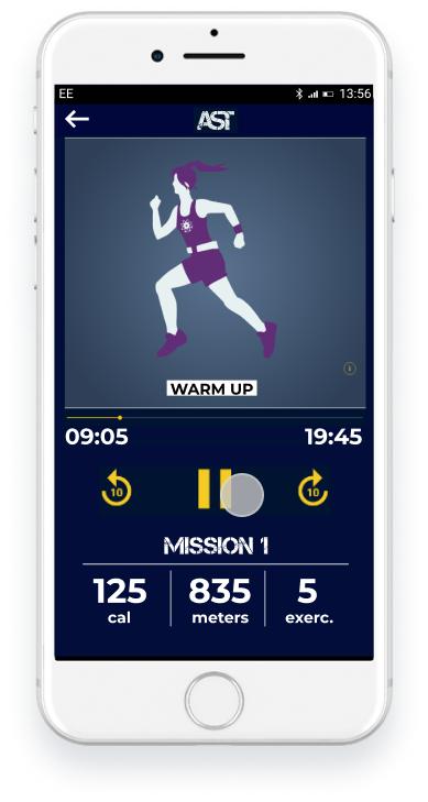
The graphics (pictures) are a very important part of this app, because it built on a story that plays in an imaginary world of Apcopalypse.
I liked the app's original logo which was created by using an existing font type(Wordmean). The font is perfectly matching with the story atmosphere, so I decided using it at the main buttons and episode titles (it has only uppercase letters).
For body text, account information and menu, I used Montserrat, because it has great readability (even if the user run) and nicely partnered up with the Wordmean font.
In colors mainly used dark blue and white, however the pictures giving more colorful presents for the app.


Simplicity was the key thoughts that lead me to design straight forward user journey and simple screens with fewer buttons and no confusing bars at all. I have created 3 different journies to introduce the design:
INTRO: this is one the most important journey as it is the (free) chance to impress the new user and deliver the GOAL - buy new episodes
PROBLEMS: overcrowded screen that distract the new user and complicated to start to exercise sessions, also every new user had been requested to sign up (even for a free session)
SOLUTIONS: simple but engaging design, that provide a short and straight forward experience (without any registration)
HOW:
1.SCREEN - 2 CTA, explanation added to ease the decision
2.SCREEN - horizontal scrolling with “cool” picture, labels and other details to recognise the appropriate trainings
3.SCREEN - existing app design, estimated details added
4.SCREEN - congratulatory screen by using data that stored (estimated)


INTRO: The 2nd free session that is very similar to the previous journey, however I had to create it newly as it the existing app didn’t exist
PROBLEMS: there were only combined full body exercises existed, that can be problematic for those who is looking for only one specific type of exercises
SOLUTION: I created trainings for only running / body weight / yoga
HOW: I used the same MISSION structure and only extended with one additional screen:
2 SCREEN: 3 CTA, self-explanatory title with cool pictures


PROBLEMS: The existing app requested every user to sign up who downloaded the app, however there is no alternative option to register (only with your details)
SOLUTION: User need to sign up only if they want to purchase a new training/mission and they can register via Facebook.
HOW: the user need to take only 6 steps to purchase a mission and start exercising


Responsive website design project
It is a 360 photography company that specialised to create virtual tours and 3D property scanning. Focusing mainly on the estate agency market, also significant number of clients from the hospitality sector.
The company required to have a website that capable to deliver the following goals:
Lead generation combined with social media
Provide a platform to contact the business and/or require a quote
Educate the clients about this new technology and the service
Professional online presence
The company was facing an unexpected situation with the COVID-19 pandemic, that's why we had to deal with a tight deadline as they had an increased demand for the service. Also, it was a startup that had a very limited budget to complete the project, that's why the cost efficiency was a high priority next to the speed.
Design a website that able to deliver the company goals. Based on the plan create a fully functioning website with the entire content requirements. Create a social media page that linked to the website and the blog. Furthermore, create regular daily content that engaging clients on the website blog which has been shared linked Facebook page.
First of all, I had to understand the service that the company provides as it is not just a simple photography service.
Looking at immediate competitors in the established Virtual tour sector, as well as smaller competitors in the 360 photography industry, gave us a good idea of what's available to customers now, and how we can do things better.
There are 3 different types of companies had to be separated during my research:

At the discovery phase of my project, I conducted competitor interviews in order to get a better understanding of the services provided on the market. There are not many 360 photographers have a detailed page on their website (mainly only for contacting purpose) and that's why we wanted to offer more. One of the extra is a price table, that puts the services in packages rather than just depending on the individual quotes (there are no fixed price, it made individually )
After when I felt like I have a direction on the paper, I put into Figma to quickly lay it out to get a better idea of how the images and text play together (see above).
Looking at the digital wireframes, it helped me to develop a solid idea of how the prototype will look like and what content i have to create. I was also able to decide what kind of pictures i need to search for (full 360 pictures or just a simple decoration picture) and where i would i use them.
I conducted a user testing with the low fidelity prototype and I found out they had been confused to see different services divided the pages (under each other) that's why I decided to change the design and put all the service only one screen. Also the price tables were far more complicated (too many feature lines with symbols) that's why i had to simplify it (reduce the lines and take off all the symbols).

Based on our research the majority of the customers checking the website by desktop however there are significant number of clients who came through via mobile, therefore it was important to create a responsive website. However our options were limited as the website had to be created in WIX. With minor changes I managed to create the site for mobiles.

Once the prototype had been developed - and before launching the product - i conducted another user testings remotely and moderated order to reveal possible usability problems. I have created a list of different tasks that they had to do (eg.: found out how much is the pro package service, requesting quotes etc). Eveluate the findings helped me to understand how to optimise the website to gain a better user experience and (eg. down active arrow on the home screen)

After the website launch we had to manage the SEO and Google ranking of the website. Needed to channel traffic to the website regardless they have interest about ordering a virtual tours or not. The company didn't have any marketing budget therefore the paid advert as the most obvious lead generator tool couldn't be an option.
During the Corona-19 pandemic lockdown, virtual tours had been more popular than any time before by estate agents and many other people who just wanted to get out from their house at least virtually. Recognise this sudden demand from every day people, I created a blog that post (daily) virtual tours about tourist attractions (occasionally virtual tours about properties as well). This blog posts linked to a Facebook page (with the same name) that keep sharing this content for those who has liked the page.
To visit the website, please click on the button